
For newcomers who don't know yet, this story is already scheduled to be published by "Familius."
Here is what I've got for my other characters so far; I think they're fun. :)
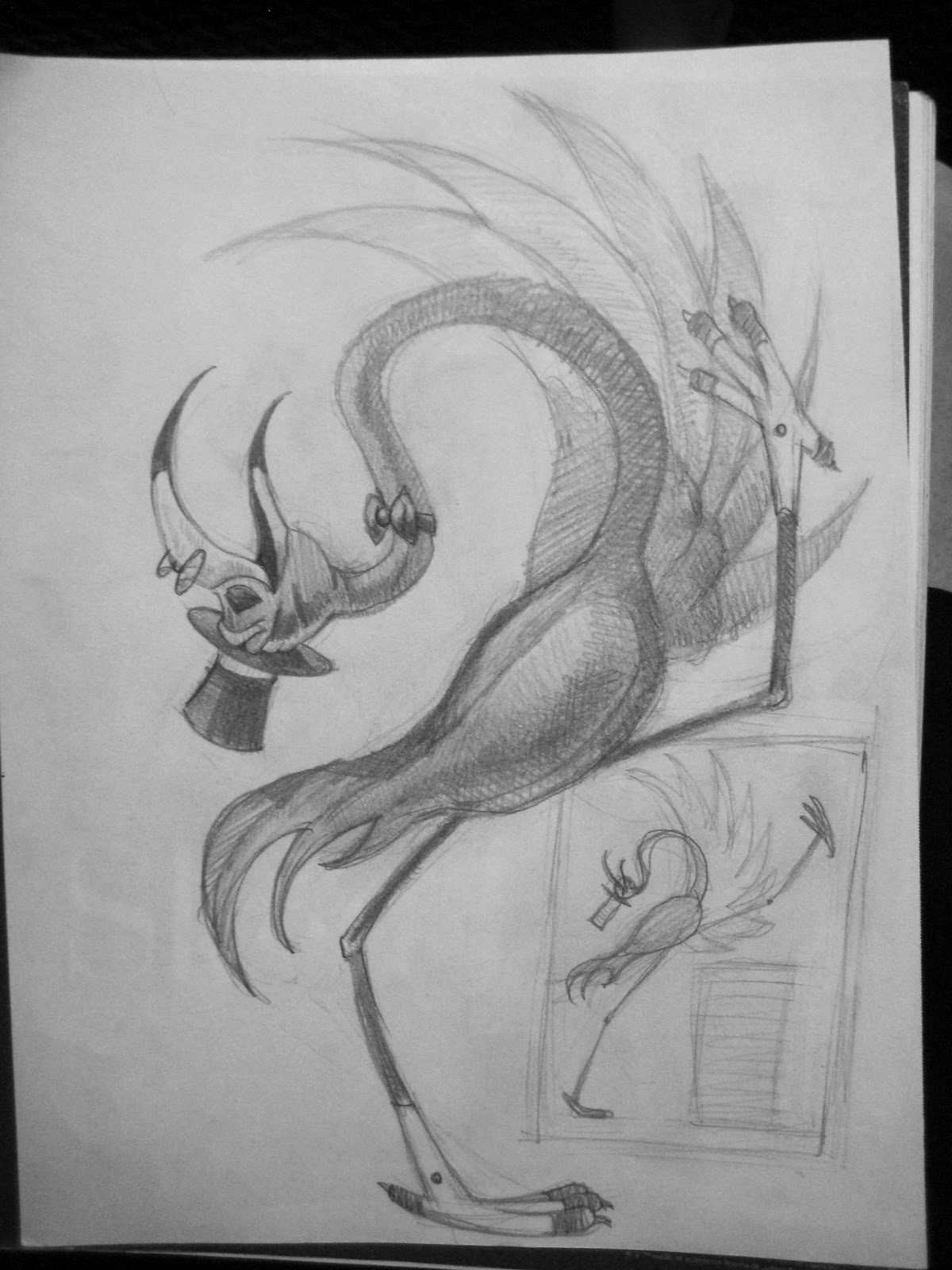
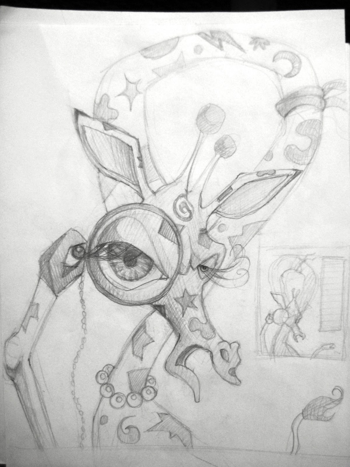
The tricky part is keeping a consistent style throughout, making them all look like they are coming from the same artist. The design of these guys ended up coming out geometricky, if that makes sense. It's a lot about shape if you notice. Hope you like them!
Feel free to let me know what you think! Good or bad.


***You can receive regular updates on the art and progress as I create "You Should You Should" by submitting your email address to "FOLLOW BY EMAIL" (found at top right of my blog). I'd love to have your input and interest as I create my first book! Please also invite your friends to do join us on the journey***
All are so fantastic! Love the giraffe, crocodile, and flamingo best! The flamingo is EXACTLY how I had pictured him to be. Love the crocodile with all his hats on his head. And the giraffe fits so well! The monkey maybe a little too dressed? While the other characters are slightly personified, monkey may be too much. Possum....debating whether I think his fur is too mussed. Your lightning bug is probably very true to how they really look. I always think of them with the big bulb on the their rear though. I love how you've "animated" it with the spinning circles around, though!
ReplyDeleteOh the big thing on the lightning bug, true! I'm actually planning to redo the swirly thing a little differently. Glad you love them! Yeah the crazy fur on the possum... all the characters have something "unique" to their design, I was trying to find something that could help possum stand out. Maybe a little too much? So the monkey... what if I told you that he's not wearing any kind of shirt? Would that help at all? Or maybe I can just give him a tie, and maybe some cuffs on his wrists, no pants?
DeleteYeah, I just think less on the monkey is better since the other characters are wearing minimal clothing. I'm not sure which of your suggestions would be better, though the tie without a shirt would be cute.
DeleteI love the flamingo's body posture, the crocodile's cheeky look and the pattern on the body of the giraffe! Such great illo's!
ReplyDeleteThanks Ramona!!
DeleteI love to see the personalities in each of your characters. I like how some are smiling and the giraffe looks very haughty. It's a good balance. You talked about wanting the characters to look like they came from the same artist, the possum is the only one that seems out of place. Judging from the rest of the comments it could be the fur :-)
ReplyDeleteThanks Sandy! You're not the only one to say that, and the repeated comment is a real good sign that it does need change. I'll be working on him some more. Thanks! Glad you like them. :)
DeleteHello Ginny:
ReplyDeleteI love the characters' expressions and the free flow of line in your art.
What publisher are you working with? I noticed the announcement but missed who the publisher was.
Thanks.
Janet
Hello Ginny:
ReplyDeleteSorry, I just now noticed the publisher you are working with. Did you shop this around beforehand as I noticed this publisher only gives you a 10% royalty. Have you had an agent, manager, or attorney look over the contract?
Janet
Hi Janet. That is true, only 10%. Is that uncommon? I'm REAL new, this is my first time working with a publisher. I'm still a student infact, and this is my BFA project I'm using to graduate with. I was just lucky enough to find someone who also wants to publish! No, I haven't contacted an agent, manager, or attorney. Like I said... I'm new. Any advice?
Delete