

Many have asked about my process and how I get my digital paintings in photoshop to look traditional. First, I learned all I know from the man, Will Terry. (and Adam Munoa gave me a quick lesson one day one on one - Thanks Adam) And my first recommendation is to learn from him through his new digital painting videos at www.folioacademy.com.
1. Make your own texture
Keep in mind the point is to create or find a surface with peaks and valleys, something that isn't smooth.
Will Terry takes a smooth surface and covers it with layers of acrylic paint and gell medium, making his own texture with large paint brushes and letting them dry. Then you separate the peaks from the valleys using a medium.
This can be done two ways:
1. Make the whole thing dark, let it dry, and carefully paint the peaks white.
Or 2. Make the whole thing white, and carefully make the peaks dark.
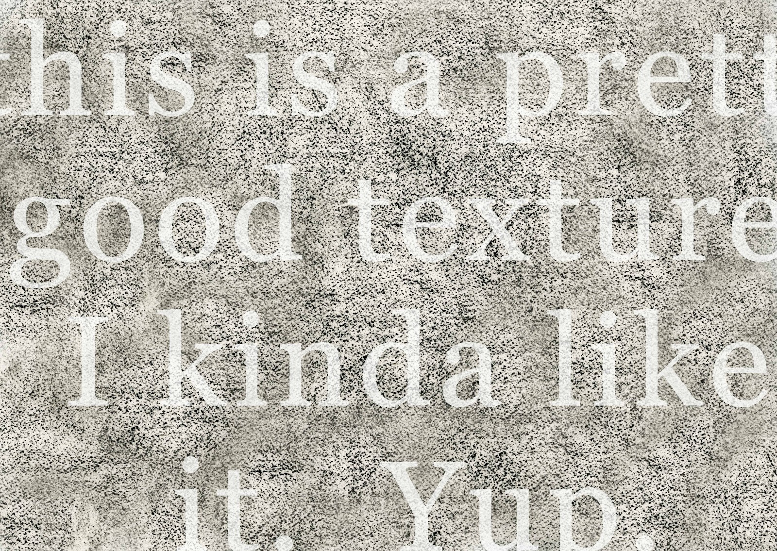
I decided to take watercolor paper (11"x14"), and gently rubbed the surface with charcoal, only coloring the "peaks," being careful not to darken the "valleys."
(Try new things and make your own - experiment! Use brick, wood, dirt, cardboard, carpet!)
Next I scanned it in a larger scanner at school. Then I took it to photoshop and used the clone tool to make it all as even as possible until I was satisfied, and played with the "brightness and contrast" as well.
Photoshop has plenty of it's own textures to choose from as well - you can experiment with those and see if you like any.
Meet my texture:
Next you need to "load" your texture as a pattern.
Open the Brushes window:

Click on the long blue bar with the arrow in it.

You'll see this drop down window:

Click on this:

See the option "Load Patterns?" Click on that:

Now find your texture wherever you saved it, and it should then show up in the list of patterns. Now you can click on it and it'll show up in this little window, ready to adjust and use:
Next you need to know about the "Mode."
See it in the middle there below? This shows the mode on "Subtract." I switch between "Multiply" and "Subtract" quite a bit, but have come to prefer it on "Subtract" most of the time.
Multiply makes the valleys dark and the peaks light.
Subtract switches it, making the valleys light and the peaks dark.
Also, above, you can see a slider near the top. This is where you can make the texture bigger or smaller. (so the "spots" can be small and dense and close together, or really huge) I am constantly adjusting that slider as I paint.
Hope that made sense and can help you!
Now, for MY process of how I do things...... at least this time around!
First, the drawing on 11"x14" paper:

Then I use one of these:
(wacom tablet - intuos 4)

I clean it up with the erase tool. When I erase INSIDE the drawing, pulling out highlights I set it at about 20% opacity:

Then a shocking realization that I forgot to cross hatch their shadows! I'll use my texture...
(don't pay attention to the colors there... they were an accident when I forgot to switch layers once)

Now I set up my layers!
I keep every layer on "normal" (see the drop-down menu on the top where it says normal?)
Except I keep my drawing layer and color layer on "Multiply" which will allow these layers to blend into all the other layers. Meaning the drawing can still be seen while the color still shows through.
I think more artists don't keep their pencil drawing in their work as much as I've been doing... but I personally like seeing the line work in art so I've been trying to preserve my drawings. Most artists I think usually end up painting completely over it the pencil.

Above you can see all my swatches I created for myself on the lower half. You can name each swatch by double-clicking after you place it there. So I have color swatches saved like "hippo toes" "Hippo highlight" and "possum feet" etc.
Next, I put the background, which is important to keeping the colors in harmony as I paint the rest, as well as keep track of values (lights and darks). I used the eraser tool set with a texture and at about 20% opacity to make it lighter behind the characters:

Next, I paint on the "color layer" which is set to multiply.
Also important to know that "multiply" will usually make your colors slightly darker. I paint this layer withOUT the texture setting, at full 100% opacity:

Then I painted on the "highlights" layer set on normal, using the texture tool! This is where it starts to look good:

Very last, I paint on the layer I set on the very top, which is set on normal. Meaning this is the only layer that can cover up the drawing when I paint. I use this for the finishing touch highlights. This is where I was able to paint the green glows in Hippo's face. The drawing was too dark in this area for it to show up on the other layers:
So there you have it. Let me know if you have questions below.
Love it. Thanks for sharing!
ReplyDeleteGlad like like it :), you are welcome and thank YOU Julie, I learned quite a lot from your blog in the beginning of this whole thing!
DeleteHi Ginny.
ReplyDeleteGreat post. Thanks for documenting the process. I didn't know about creating your own textures in PS before.
The finished illustration is simply amazing. I love the texture, the shadings, and the color. I wish I can illustrate at your level. Haha.
How long did it take you to do this?
Gloson
Hi Gloson!
DeleteTextures is a GREAT feature. Some artists have figured out how to make their digital paintings look so traditional nobody can tell they're digital.
I'm glad you like it! With practice you will be able to reach any level you want. :)
I've been lazily working on the design/drawing part off and on for a few months. But once I sat down to finish it, I made the final drawing in one day, and got the painting done in another day.
Thanks for your comments!! I'm honored. :)
I see, Ginny. You're welcome! Do you draw human characters as well, and if so, where can I see them?
DeleteYour illustrations of animals are so nice I might consider you illustrating a book I'm thinking of publishing in the future--"The Llama Who Likes Drama: and 7 other wacky animal poems". :P
The level which I am at now is line drawings, which I load up in photoshop and bestow gradients upon, such as this one: https://www.facebook.com/photo.php?fbid=332402460210645&set=a.225432397574319.47901.221640057953553
I'll take inspiration from you and try out textures and more complicated shadings. :)
Thank you,
Gloson